PIZZA SAM’s BRAND REFRESH
The purpose of this project was to reimagine an existing brand while maintaining the logo's familiarity.
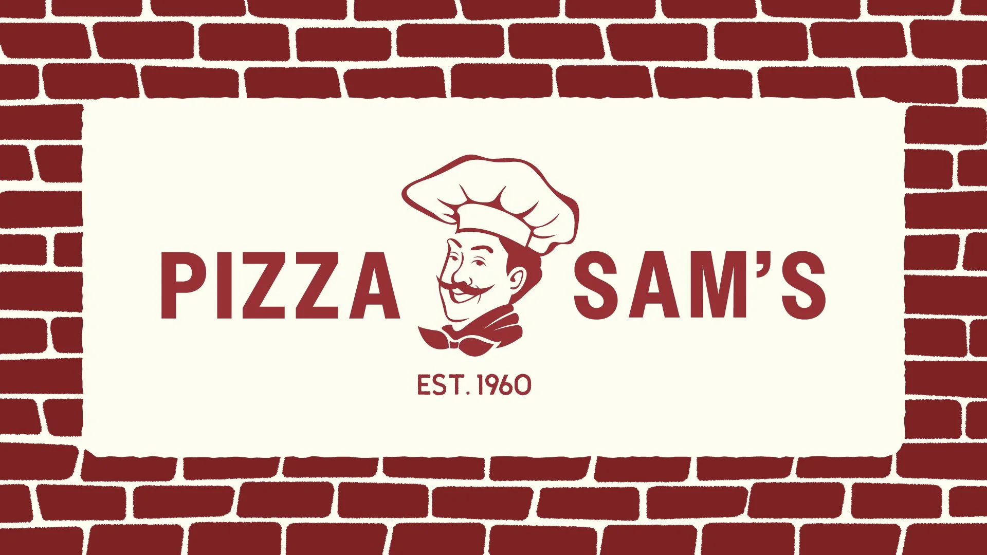
Pizza Sam’s is an established pizza and sandwich restaurant in my family’s hometown of Midland, Michigan. Inspired by my fond memories of spending nights chatting over oven-baked pizza, this rebrand aims to tap into that nostalgia while highlighting Pizza Sam’s role as a cultural epicenter in small-town Michigan. It presents a refreshed version of Pizza Sam himself, embracing the iconic colors, imagery, and feel.
OLD

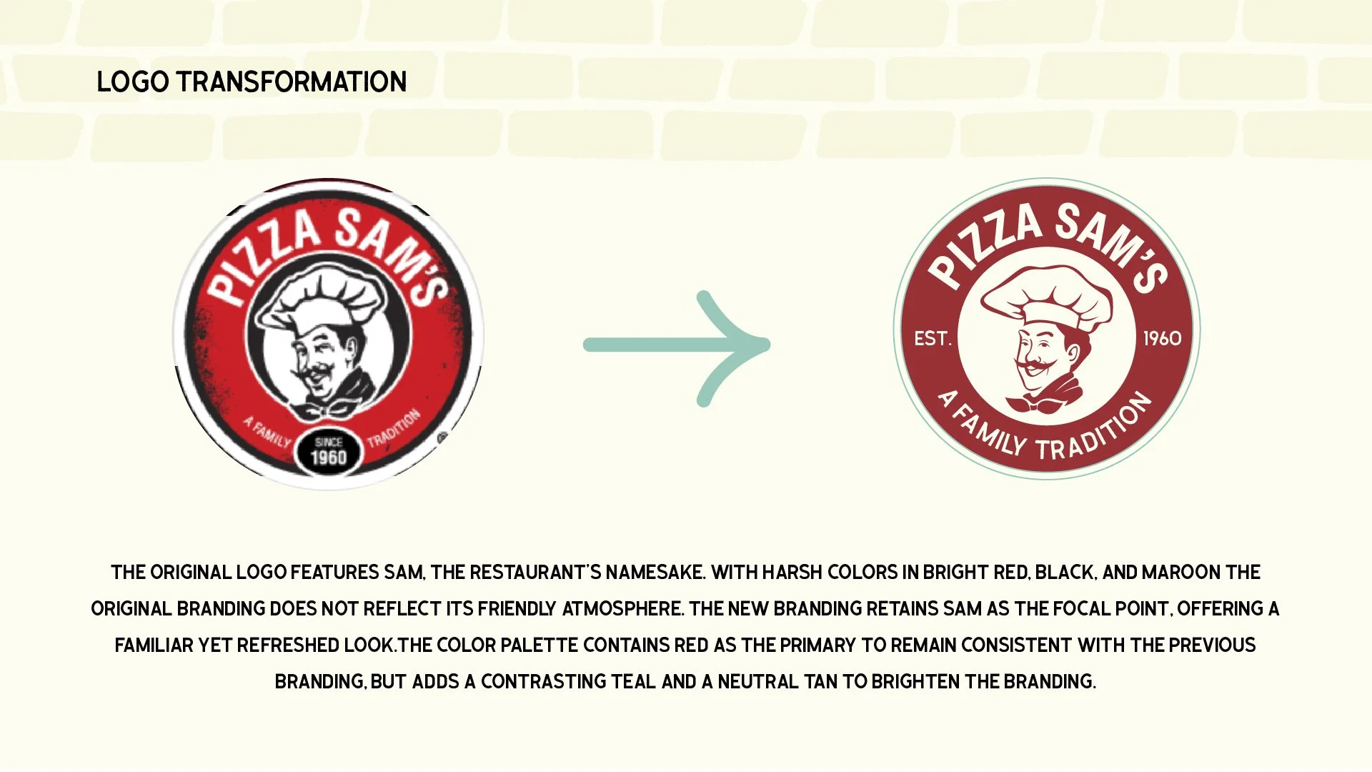
The original logo features an image of Sam, the restaurant’s namesake. With a harsh color palette featuring bright red, black, and maroon, the existing branding is dated and does not reflect the friendly atmosphere its patrons know and love.

refreshed
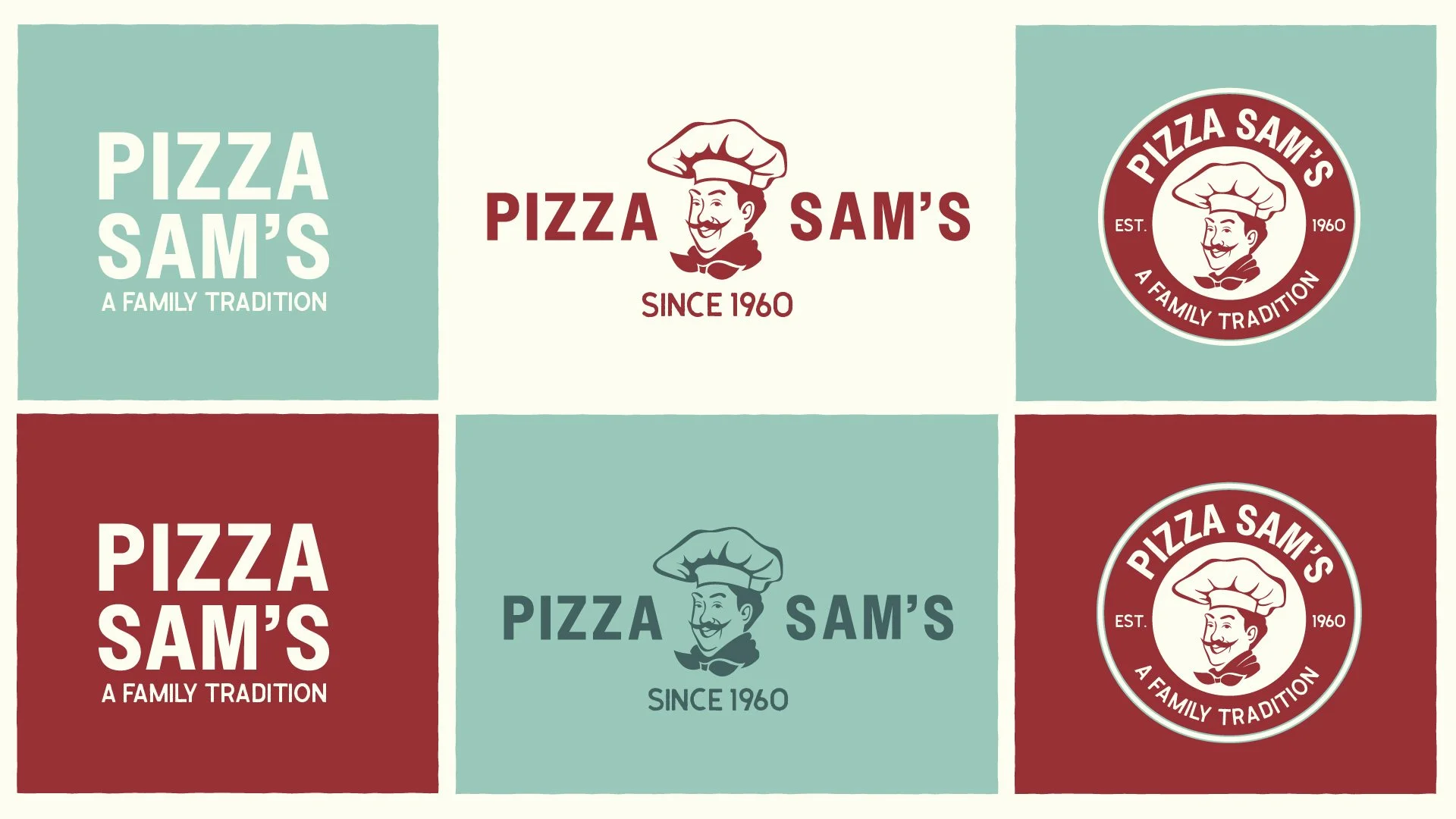
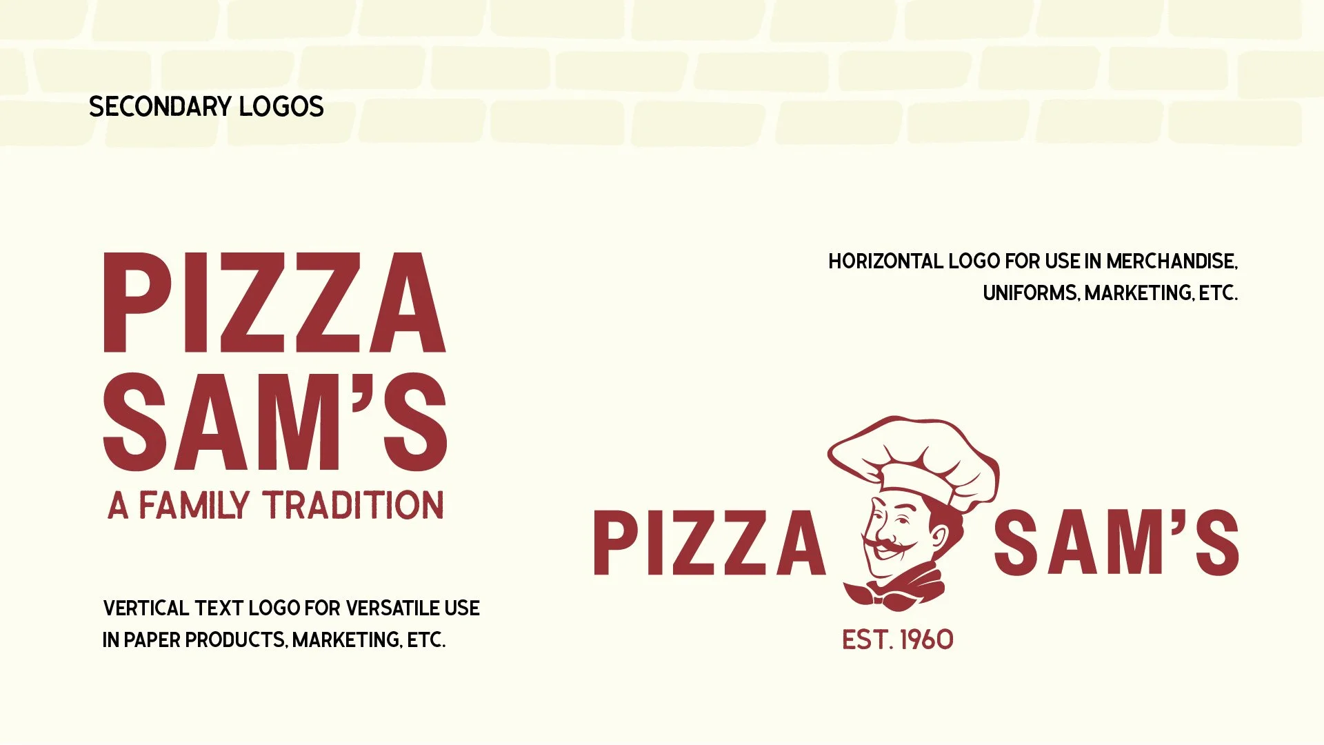
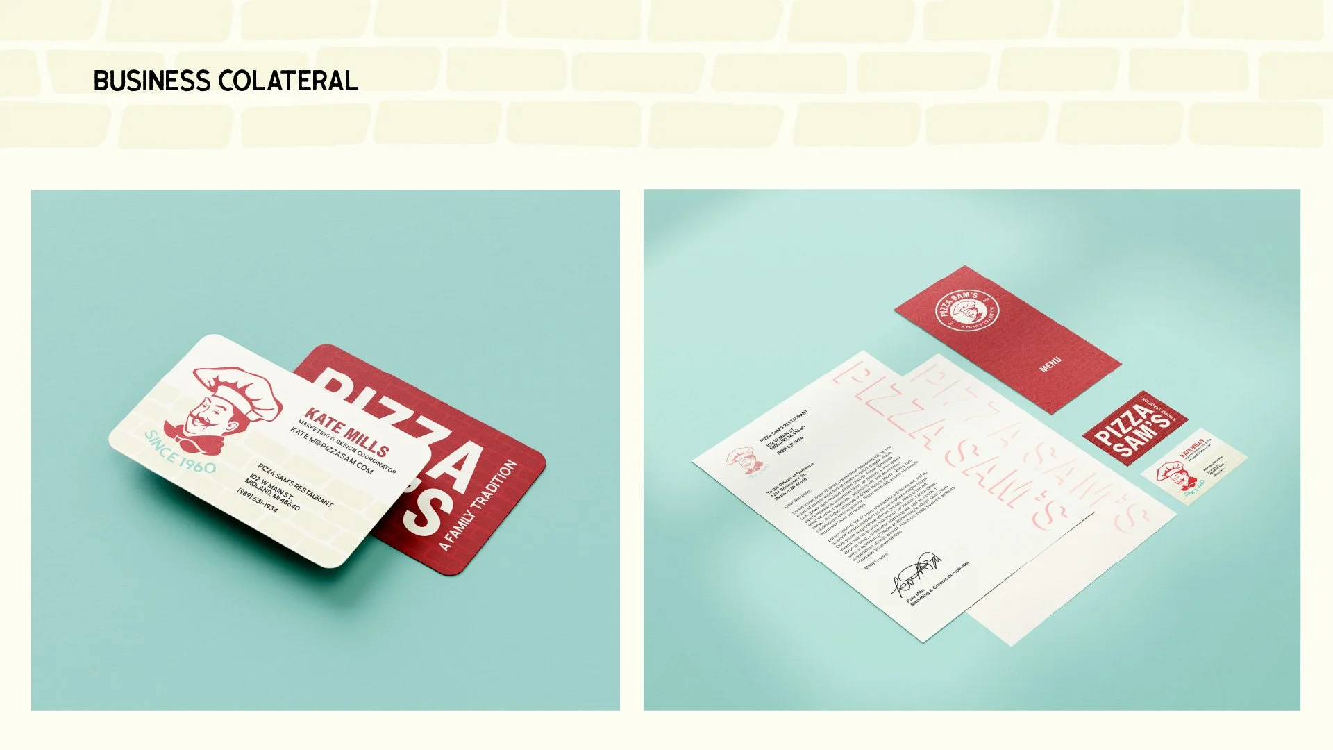
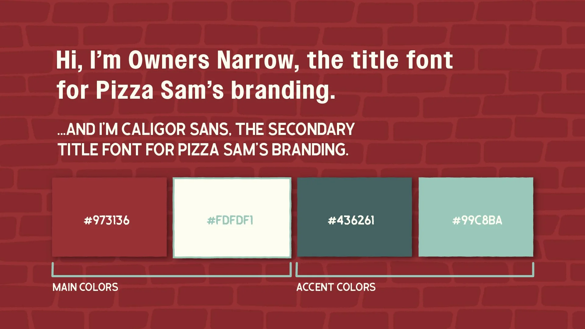
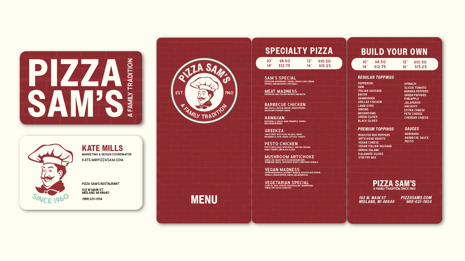
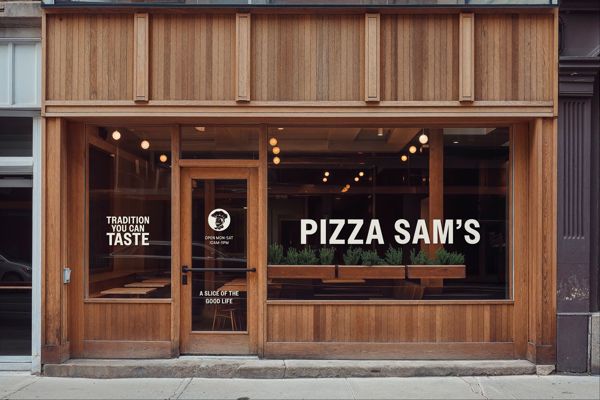
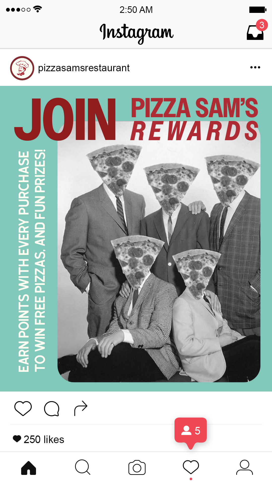
Sam remains a focal point in the new branding, offering a familiar yet refreshed look, mindfully designed for the digital age and physical world. The primary color remains red to pay homage to its original brand, but introduces a contrasting teal to soften the look.


This brand refresh aims to entice customers with traditional recipes and colorful and fun advertising. Using nonconventional black and white grainy photos for posts, an air of nostalgia and youthfulness makes the brand engaging and visually relatable.


Brand refresh slide deck